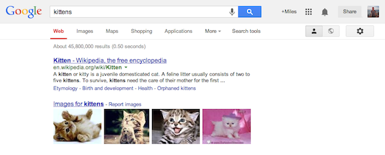
Google has just announced that it is updating its iconic emblem with a refined color palette and slightly altered letter shapes. The revised design matches the flatter Google logo that appeared earlier this month, and Google says it will roll out across more products and services in the coming weeks.
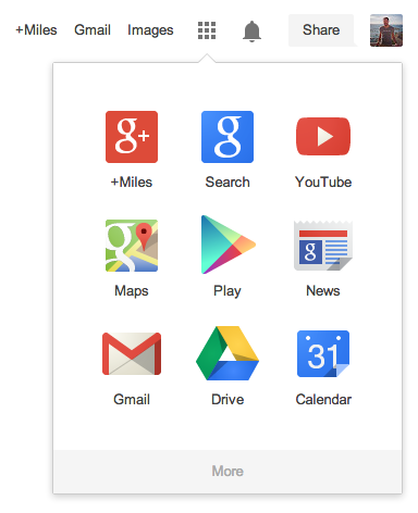
Simultaneously, the company has revamped its traditional navigation bar in an attempt to bring users a more streamlined experience. Gone is the black bar many users see today; instead, Google's products are now organized into the same apps grid seen on Android, providing quick access to the company's most frequently used services.
Google's updated logo isn't exactly a complete overhaul, but it matches nicely with the design language the company has implemented across Android and iOS in recent months.


No comments:
Post a Comment